On Friday the 26th of February, myself and Ray were able to meet up to discuss the project in further detail, although we will have to do this again because of an absence, We have collated ideas and created a google document meaning that we are all able to share, update and access planning, production materials and brainstorms…
https://drive.google.com/drive/folders/0B6Jyc0JkMKkrM0NCNmJyTC14WTA
After discussing the brief and proposal in more depth, Ray stated that she made the decision to keep the website structure and appearance plain and simplistic because we want to keep the focus on our images and the removal of “Branding”, we don’t want our website to appear cluttered with logos and symbols to avoid contradiction or misinterpretation of our images. When discussing our project further, I began to make connections between the texts we have come across this semester, in particular “Spectacle. 2.0” (2010). I felt that this text linked well with our proposal as we are looking at the everyday in an unconventional manner but we are also exploring and developing the ideas of the ‘Derive’ and ‘Detournament’. We plan to subvert commodity meaning through the removal/absence of brands and advertising, we want to directly remove an obvious part of the image to raise awareness to contemporary social concerns such as capitalism. Both Ray and myself explored and discussed various different approaches to our project, we considered blurring particular brands, removing them or even manipulating them; however we both agreed that we need to consider the time we have to complete this to an acceptable standard, deciding to stick with the idea of removal.
We also discussed and explored the construction of compositions, we considered taking various different photographs from one scene from different angles, (eg. close up, long shot, etc) and combining them together to create one scene or composition…

Blurring Images…

 After discussing the project brief in greater detail with Ray we both agreed to take a few trial photos and to manipulate these to gain a greater insight as to what our project will begin to look like… I downloaded the image editing software
“GIMP” and used this to remove text and branding from each image.

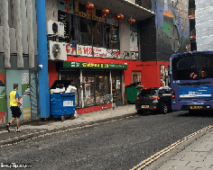
I began by opening my images in the editing software and I used the dropper tool
to pick the correct colour and painted this over the text to fill
it in and make the images advertising and brands disappear from the image. To complete the image I used blurring tools to smooth over any obvious brush marks. Here are some examples…
Trial Run…
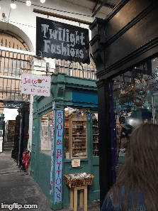
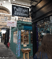
I found editing some of these particularly difficult due to the stark variation in colours, some taking a few minutes to edit and others taking much longer. These images were taken on my phone, as you can see, the resolution isn’t that great in the final product, to combat this we plan to shoot images on a high quality camera with a high resolution.
We plan to get together as a group break down certain locations into each person, take a set of images and review what works well and what doesn’t. After we have reviewed this extensively as a group then we plan to collate the selection of 8-12 images but to reshoot these on a high resolution camera and then edit these accordingly.
 This selection of images were put together using an online GIF creator called IMG Flip [https://imgflip.com/images-to-gif], in the future we plan to use different software because the site compresses the images down to a low resolution and size, diminishing quality and depth of field.
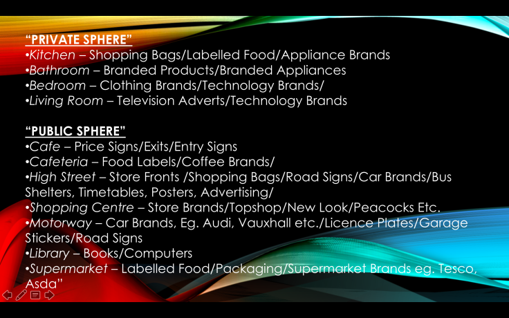
We have had a discussion about locations and we have decided to break the location down into segments from the public and private sphere. From there we will split up between the three of us and decide which location is more accessible to each individual…

Leave a comment